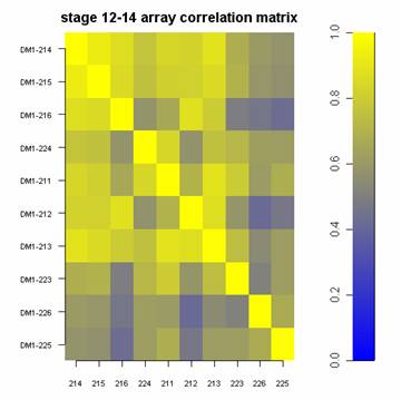
placed on several different DNA microarrays correlate with one another.
Solution: Use the function below by handing it a matrix of numbers. It will plot the matrix with a color scale based on the highest and lowest values in the matrix. Optional arguments are:
usage: myImagePlot(m) where m is a matrix of numbers
optional arguments: myImagePlot(m, xlabels, ylabels, zlim, title=c("my title"))
|
|
|
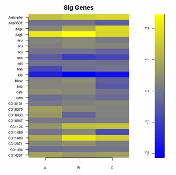
| 1.) A panel of gene expression values. | 2.) A table of correlation values illustrating how identical samples placed on several different DNA microarrays correlate with one another. |
The images above were generated as follows:
myImagePlot(bm[1:25,1:3], yLabels=c(as.character(baylies[1:25,2])), title=c("Sig Genes"))
myImagePlot(cm, xLabels=c(targets$SlideNumber), title=c("stage 12-14 array correlation matrix"), zlim=c(0,1))
You can load the function below into your R session by copy and paste, or you can load it directly using the source command:
source("http://www.phaget4.org/R/myImagePlot.R")
| image plot function |
# ----- Define a function for plotting a matrix ----- #
myImagePlot <- function(x, ...){
     min <- min(x)
     max <- max(x)
     yLabels <- rownames(x)
     xLabels <- colnames(x)
     title <-c()
  # check for additional function arguments
  if( length(list(...)) ){
    Lst <- list(...)
    if( !is.null(Lst$zlim) ){
       min <- Lst$zlim[1]
       max <- Lst$zlim[2]
    }
    if( !is.null(Lst$yLabels) ){
       yLabels <- c(Lst$yLabels)
    }
    if( !is.null(Lst$xLabels) ){
       xLabels <- c(Lst$xLabels)
    }
    if( !is.null(Lst$title) ){
       title <- Lst$title
    }
  }
# check for null values
if( is.null(xLabels) ){
   xLabels <- c(1:ncol(x))
}
if( is.null(yLabels) ){
   yLabels <- c(1:nrow(x))
}

layout(matrix(data=c(1,2), nrow=1, ncol=2), widths=c(4,1), heights=c(1,1))

 # Red and green range from 0 to 1 while Blue ranges from 1 to 0
 ColorRamp <- rgb( seq(0,1,length=256),  # Red
                   seq(0,1,length=256),  # Green
                   seq(1,0,length=256))  # Blue
 ColorLevels <- seq(min, max, length=length(ColorRamp))

 # Reverse Y axis
 reverse <- nrow(x) : 1
 yLabels <- yLabels[reverse]
 x <- x[reverse,]

 # Data Map
 par(mar = c(3,5,2.5,2))
 image(1:length(xLabels), 1:length(yLabels), t(x), col=ColorRamp, xlab="",
 ylab="", axes=FALSE, zlim=c(min,max))
 if( !is.null(title) ){
    title(main=title)
 }
axis(BELOW<-1, at=1:length(xLabels), labels=xLabels, cex.axis=0.7)
 axis(LEFT <-2, at=1:length(yLabels), labels=yLabels, las= HORIZONTAL<-1,
 cex.axis=0.7)

 # Color Scale
 par(mar = c(3,2.5,2.5,2))
 image(1, ColorLevels,
      matrix(data=ColorLevels, ncol=length(ColorLevels),nrow=1),
      col=ColorRamp,
      xlab="",ylab="",
      xaxt="n")

 layout(1)
}
# ----- END plot function ----- #
|